
Web design might seem confusing at first, but it’s easier once you know what to focus on. There are tools to learn, terms to understand, and decisions to make before you even start building. Whether you’re creating a personal site, helping someone else, or exploring web design as a career, it’s normal to have questions.
This blog answers common questions about starting a web design career, understanding client needs, applying design principles, building strong layouts, and making websites work smoothly on all screen sizes.
Let’s begin.
Career in Web Design
Decided on web design as a career? Here’s what to know, what skills matter, where to begin, and what the day-to-day work actually looks like.
Is web design a good career choice today?
Yes, because businesses rely on well-designed, user-friendly websites to attract and keep customers. Skilled designers who understand responsive layouts, UX, and accessibility are in demand. Whether freelancing or working in a company, it’s a flexible career path with strong, lasting opportunities.
How do freelance web designers set their rates?
Freelance web designers typically set their rates based on experience, project complexity, and the client’s budget. Beginners often charge by the hour, while experienced designers prefer project-based or value-based pricing.
Common methods include hourly rates, flat fees for standard packages (like landing pages), or tiered pricing for different levels of service. Researching competitors and factoring in time, revisions, and overhead ensures fair pricing.
What skills do employers look for in a junior web designer?
Employers usually expect junior web designers to have:
- HTML & CSS – solid foundation in web structure and styling.
- Responsive design knowledge – ability to build mobile-friendly layouts.
- Basic JavaScript – for interactivity and simple functionality.
- Portfolio – showcasing real projects and creativity.
- Soft skills – communication, problem-solving, and teamwork.
Can you become a web designer without a degree?
Yes, a degree isn’t required. Many web designers succeed through:
- Self-teaching via tutorials, blogs, and YouTube.
- Online courses & certifications from platforms like Coursera or freeCodeCamp.
- Building a portfolio with personal or freelance projects.
- Practical skills in coding, design tools, and UX principles.
- Experience that demonstrates problem-solving over formal education.
How long does it take to become job-ready as a self-taught designer?
With consistent practice, most people can become job-ready in 4-6 months. Focus on mastering HTML/CSS, responsive design, and UX basics, while also learning a design tool like Figma. Build a portfolio of 3-5 projects that show real-world problem-solving.
Networking, freelancing on small gigs, and practicing effective client communication can also accelerate your readiness.
What’s the difference between a web designer and a UI/UX designer?
These roles often get mixed up, but they focus on different parts of the process. Here’s how web designers and UI/UX designers compare side by side.
| Aspect | Web Designer | UI/UX Designer |
| Primary Focus | Visual layout, color schemes, typography, and overall website aesthetics | User experience, usability, flow, and interface interaction |
| Key Skills | HTML, CSS, basic JavaScript, design tools (Figma, Photoshop, XD) | Wireframing, prototyping, user research, journey mapping, usability testing |
| Deliverables | Page designs, responsive layouts, style guides, branded assets | Wireframes, prototypes, user personas, research insights, usability reports |
| Tools Used | Figma, Adobe XD, Photoshop, Webflow, Sketch | Figma, InVision, Axure, Miro, usability testing tools |
| End Goal | Create visually appealing, functional websites | Ensure websites/apps are easy to use and meet user needs |
| Involvement | Often responsible for coding and front-end design | More focused on research, structure, and testing user journeys |
| Client Interaction | Discuss branding, style preferences, and content placement | Conduct interviews, surveys, and usability tests to understand user needs |
| Outcome | A website that looks good and works on different devices | A website/app that feels intuitive and user-friendly |
Understanding the difference helps you choose the right focus or collaborate better if you’re working with both skill sets.
Do web designers need to know how to code?
Yes, a solid understanding of HTML, CSS, and responsive design principles is essential. While deep JavaScript knowledge isn’t always required, it can be a valuable advantage. Even with no-code tools like Webflow, coding knowledge provides designers with more control, enhances collaboration with developers, and opens up additional career opportunities.
What are the best online certifications for web designers?
Some of the most recognized online certifications are:
- Google UX Design Certificate (Coursera) – beginner-friendly, industry-recognized.
- freeCodeCamp – free, hands-on coding and responsive design practice.
- CareerFoundry – structured career-change programs with mentorship.
- Skillshare – short, practical courses covering design and tools.
- Interaction Design Foundation (IDF) – affordable, research-driven UX courses.
While certifications aren’t mandatory, they build credibility and can help juniors stand out.
Is it better to work as a freelancer or at a design agency?
Freelance web designers work independently with a flexible schedule and more creative control. They set their own rates and choose clients, but income can be inconsistent and requires finding work yourself.
Agency designers work in a team with steady pay, structured guidance, and assigned projects. Creative choices may be limited, but it’s more stable and offers mentorship. Freelancing suits experienced, self-driven designers.
Agencies are better for beginners or those who prefer teamwork and consistency.
Now that you know how to start in web design, let’s look at the basic rules that help websites feel easy to use and understand.
Core Principles & Rules of Web/UX Design
Good design isn’t just about looks, it’s about function. The key principles below help make websites easy to use, clear to navigate, and genuinely helpful to anyone who visits.
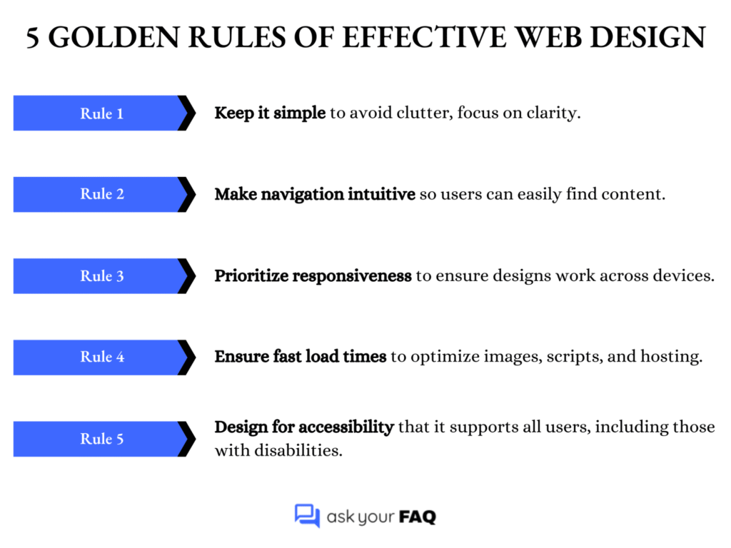
What are the five golden rules of effective web design?
Effective web design follows five rules: keep it simple, make navigation intuitive, ensure responsive layouts, optimize for speed, and design for accessibility. These principles create straightforward, user-friendly, and professional websites that deliver smooth performance and inclusive experiences across all devices.
Here’s a quick summary of the five golden rules every designer should keep in mind when building a site.
How does the 3-30-3 rule apply to website engagement?
The 3-30-3 rule describes user attention: You have:
- 3 seconds to grab their interest.
- 30 seconds to explain the value.
- 3 minutes to engage them fully.
To apply it, use clear headlines, concise messaging, and compelling design that encourages users to scroll, explore, or act within those time frames.
What are the 5 W’s of UX design, and how do you use them?
The 5 W’s provide a framework for user-focused design:
- Who – Identify the user (age, role, skills, preferences).
- What – Define their needs or tasks to accomplish.
- When – Consider timing or frequency of use.
- Where – Know the device, environment, or context.
- Why – Understand their motivation or problem to solve.
Using these questions ensures that design choices align with real user behavior, making experiences more intuitive and purposeful.
What is the F-pattern, and why is it critical in layout design?
The F-pattern describes how users scan pages, moving across the top, then down the left side, and across again, forming an “F.” Designers place key content, such as headlines, CTAs, and menus, along these lines. Understanding this behavior improves readability, highlights essential content, and prevents important details from being overlooked.
What is visual hierarchy, and how can it improve usability?
A visual hierarchy arranges elements to convey importance through the use of size, color, contrast, and spacing. It guides users’ eyes, making content easier to scan and understand. For example, large bold headlines grab attention, while smaller text explains details. A good hierarchy reduces confusion, highlights priorities, and makes calls to action more effective.
What are the top accessibility rules every designer must follow?
Key accessibility rules (based on WCAG basics) include:
- High color contrast for text and backgrounds.
- Alt text for all images and visuals.
- Keyboard navigation support for non-mouse users.
- Proper heading structures (H1, H2, H3) for clarity.
- Readable fonts with adequate size and spacing.
- Avoid using color alone to convey meaning.
Following these rules ensures inclusivity, better usability, and improved SEO.
How do you apply Hick’s Law in web design?
Hick’s Law states that “decision time increases with the number of options.” Apply it by simplifying menus, limiting choices in forms, and highlighting the most important call-to-action. For example, instead of giving six button options, focus on one or two. This enables faster user journeys, reduces overwhelm, and improves conversion rates.
Web Design Foundations & Components
To build a solid website, you first need to understand the basic parts that hold it all together. Here’s what makes up a website and how it all fits together.
What are the four essential components of a high-performing website?
The essentials are: design, functionality, content, and performance. Design ensures visual appeal, functionality covers features and usability, content provides value to users, and performance ensures fast loading and smooth interaction. When these four work together, a website becomes user-friendly, engaging, and effective in meeting business goals.
What are the three types of web pages every site needs?
Every site should include:
- A homepage – to introduce the brand and guide visitors.
- An about page – to explain who you are and build trust.
- A contact page – to provide easy ways to get in touch.
These pages cover awareness, credibility, and accessibility for users.
What is the difference between static, dynamic, and CMS-based websites?
Not all websites are built the same way. Let’s break down the main types: static, dynamic, and CMS-based, to see how they work and when to use each.
| Type of Website | Description | Best For |
| Static | Built with fixed HTML/CSS files | Small sites with few pages |
| Dynamic | Content generated in real-time (e.g., dashboards, user accounts) | Web apps, portals, large-scale sites |
| CMS-based | Managed via platforms like WordPress or Shopify | Blogs, business sites, e-commerce |
How do you decide on the number of pages a site should have?
Base it on goals, audience needs, and content availability. Start with essential pages (home, about, services/products, contact), then add supporting ones like blog or FAQs if relevant. Avoid unnecessary pages; quality and clarity matter more than quantity. The structure should help users reach their goals quickly.
What are the basic contents of an HTML structure?
A standard HTML page includes:
- <!DOCTYPE html> declaration.
- <html> root element.
- <head> for metadata, title, and linked styles/scripts.
- <body> for visible content such as text, images, and layout elements.
- Semantic tags, such as <header>, <main>, and <footer>, are used to organize the structure.
This skeleton forms the foundation of every website.
How many columns should you use in a web design layout?
Most modern designs use a 12-column grid system because it’s flexible for responsive layouts. It allows easy splitting into halves, thirds, or quarters. However, simpler sites may use 2-4 columns depending on content. The key is maintaining balance and readability across different screen sizes.
What is the role of grids in modern web design?
Grids help web design by:
- Creating structure – organizing content into rows and columns.
- Maintaining alignment – ensuring elements line up neatly.
- Improving readability – guiding the user’s eye smoothly.
- Supporting responsiveness – layouts adapt well to different screen sizes.
- Balancing aesthetics with usability – clean, professional, and user-friendly designs.
What is a wireframe, and why is it important?
A wireframe is a basic outline of a webpage layout, showing the placement of elements such as headers, images, text, and buttons. It’s not about colors or visuals but structure. Wireframes help align ideas, test user flow, and get client approval before investing time in detailed design or coding.
What are the standard web design file formats used in 2025?
Common formats include:
- Figma/Sketch/Adobe XD files for design mockups.
- SVG for scalable icons and graphics.
- PNG/JPEG/WebP for images.
- MP4/WebM for video.
- HTML/CSS/JS for code exports.
Using the correct format ensures speed, quality, and compatibility across devices and browsers.
A well-built site is excellent, but what happens when it leaves your laptop? Next, let’s ensure it adapts, flexes, and performs well on any screen.
Understanding Project Goals & Requirements
Before you start designing, it’s important to know what the client wants. Ask simple questions about their goals and what features they need. Getting clear answers early helps avoid confusion later and makes the whole process smoother.
What are the top 10 questions to ask a new web design client?
When onboarding a client, ask:
- What are your main business goals for the website?
- Who is your target audience?
- Do you have a preferred style or design inspiration?
- What features or functions do you need (e.g., forms, e-commerce)?
- Is the content ready (text, images, videos)?
- What is your budget range?
- What is your ideal timeline or deadline?
- Who are your main competitors, and what do you like/dislike about their sites?
- Do you have existing brand assets (logos, fonts, colors)?
- Do you prefer a specific platform (WordPress, Shopify, Webflow)?
How do you identify a client’s target audience for web design?
To identify the target audience, you should:
- Ask who their ideal customers are.
- Define key details: age, interests, pain points, and goals.
- Review existing customer data, analytics, or surveys.
- Study competitors’ audience targeting for insights.
- Translate findings into design choices, tone, visuals, navigation, and calls to action.
- Ensure the site attracts and guides the right audience toward desired actions.
What should be included in a website design questionnaire?
A solid website design questionnaire should cover:
- Business goals – what the site should achieve.
- Target audience – who the site is for.
- Competitor analysis – strengths and weaknesses of others’ sites.
- Style preferences – design inspirations, colors, or layouts.
- Required pages – homepage, about, services, contact, etc.
- Content readiness – text, images, or videos available.
- Brand assets – logo, fonts, colors, guidelines.
- Must-have features – forms, e-commerce, booking tools, etc.
- Budget – realistic range for design and development.
- Timeline & deadlines – expected launch or milestone dates.
- Ongoing maintenance – who will update and manage the site.
How do you define the goal of a website with a client?
To define the goal clearly:
- Ask what success looks like (leads, sales, awareness, support).
- Use open-ended questions to uncover true priorities.
- Identify the primary action users should take (e.g., booking a call, making a purchase, subscribing).
- Clarify secondary goals, such as branding or information sharing.
- Align the design structure to support the main goal first.
- Confirm agreement with the client before starting design.
What is a sitemap, and when should you introduce it to the client?
A sitemap is a visual representation of all the website’s pages and their interconnections. Introduce it at the planning stage, right after defining goals and content requirements. This helps clients visualize the site structure, confirm the navigation flow, and agree on what’s included before you begin the actual design or development work.
How do you gather content from a client effectively?
To collect content smoothly:
- Provide a content checklist (including text, images, videos, and brand assets).
- Set clear deadlines to keep the project on track.
- Use shared folders/tools like Google Drive or Dropbox.
- Specify file formats and quality requirements.
- Educate the client on the importance of high-quality content.
- Offer support for copywriting, editing, or stock photos if needed.
What technical requirements should you ask about before starting?
Before starting, confirm the client’s:
- Hosting provider and plan details.
- Domain ownership and setup.
- Preferred platform/CMS (WordPress, Shopify, Webflow, etc.)
- Security needs – SSL, backups, firewalls.
- Third-party integrations – CRM, booking tools, email marketing.
- Analytics setup – Google Analytics, tracking tools.
- Accessibility requirements – compliance with WCAG/ADA.
- Scalability plans – future growth, e-commerce expansion, or multi-language support.
How do you handle unclear or incomplete briefs from clients?
Ask clarifying questions and break the project into smaller sections, focusing on goals, features, audience, and content. Provide examples or references to guide their decisions. Document assumptions and confirm in writing.
Avoid starting complete design work until requirements are precise; otherwise, you risk scope creep, misunderstandings, and wasted time on avoidable revisions.
How do you explain responsive design or SEO to non-technical clients?
Use simple analogies. Explain responsive design as “a website that adapts to look good on phones, tablets, and desktops, like water fitting into any container.” Describe SEO as “making your site more visible on Google so the right people can find it.” Keep it clear, visual, and focused on benefits.
What are the red flags to look out for in client onboarding?
Watch out for clients who:
- Have vague goals and unclear expectations.
- Refuse to share a clear budget.
- Set unrealistic deadlines.
- Show poor communication habits early on.
- Mention “unlimited revisions” casually.
- Avoid contracts or agreements.
- Expect free work or spec work.
- Try to micromanage every step.
- Ignore your process and boundaries.
Spotting these signs early helps you decide whether to accept or decline the project.
Getting client clarity is only half the job. The real impact comes from how you design the site. Next, we’ll cover the key principles that keep websites simple, usable, and effective.
Making Your Website Work on Any Device
A great website should feel right no matter the screen size. The questions below explain how to design layouts that adjust smoothly across phones, tablets, and desktops, so your site works well everywhere.
What are the core principles of responsive design?
The main principles are:
- Fluid layouts – use relative units (%, em, rem) instead of fixed pixels.
- Flexible media – images, videos, and other elements scale within containers.
- Media queries – CSS rules adapt styles for different screen sizes.
Together, these ensure a website looks good and functions well across desktops, tablets, and mobile devices without separate versions.
What’s the difference between responsive, adaptive, and mobile-first design?
To understand how different approaches handle screen sizes, here’s a quick comparison of responsive, adaptive, and mobile-first design:
| Approach | Description | Pros | Cons | Best Use Case |
| Responsive | Uses fluid grids and media queries to adapt automatically across screens | Flexible, future-proof, widely used | It can be harder to perfect on huge/small screens | General websites needing broad compatibility |
| Adaptive | Uses fixed breakpoints with distinct layouts for each device type | Optimized layouts, predictable design | Less flexible, requires multiple versions | Apps or sites targeting specific devices |
| Mobile-first | Starts with a mobile layout, then enhances for larger screens | Prioritizes small screens, efficient | May feel limited on the desktop if not scaled well | E-commerce, apps, or sites where mobile dominates |
Each approach has its place; what matters most is choosing the one that fits your project’s needs and user behavior.
What screen sizes should you design for in 2025?
Instead of designing for single devices, focus on common breakpoint ranges:
- 320-480px – small phones.
- 481-768px – large phones and small tablets.
- 769-1024px – tablets and small laptops.
- 1025-1440px – desktops and standard monitors.
- 1441px+ – large/ultra-wide screens.
Also consider foldable phones and emerging devices. Always test with flexibility in mind across ranges to ensure seamless user experiences.
How can you test if your site is responsive across devices?
Use browser developer tools (such as Chrome’s device emulator) to test different screen sizes. Check on real devices if possible. Online tools like BrowserStack or LambdaTest can also be helpful. Focus on layout consistency, image scaling, navigation usability, and interactive elements. Real-world testing is crucial, as simulators often fail to reflect the actual behavior of devices accurately.
What are the three core ingredients of responsive web design?
The three essentials are:
- Fluid grids – use percentages instead of fixed units.
- Flexible images and media – scale or crop according to container size.
- CSS media queries – apply breakpoints for different screens.
Combined, they ensure designs adapt smoothly, maintaining usability and visual appeal across a wide variety of devices and resolutions.
Should you use a framework like Bootstrap or custom CSS?
Frameworks like Bootstrap or Tailwind accelerate development with pre-built responsive grids and components, making them ideal for faster projects. However, custom CSS offers more flexibility, less bloat, and cleaner performance for unique designs. The choice depends on project needs: use frameworks for speed, custom CSS for complete control, and optimization.
What are the challenges with viewport scaling and font sizes?
Key challenges include:
- Tiny text on small screens is making content difficult to read.
- Oversized fonts on desktops are disrupting the balance.
- Inconsistent scaling across different browsers and devices.
- Balancing readability with responsive layout requirements.
- Choosing the right units, such as em, rem, vw, and vh, for flexibility and responsiveness.
- Needing testing on multiple devices to ensure proper readability and consistency.
How can you optimize touch interactions for smaller screens?
Make interactive elements finger-friendly. Ensure buttons are at least 44px by 44px, space links apart, and avoid tiny tap targets. Use large, legible fonts, simple navigation, and gestures like swiping when appropriate. Always test on real devices to check comfort and accuracy. A well-designed touch interface prevents user frustration on mobile devices.
Web Design FAQ: Time to Start Designing with Clarity
Web design can seem hard at first, but it becomes easier once you understand the basics. In this blog, we went over how to start a career in web design, what good design looks like, what parts make up a website, and how to make your site work well on all screen sizes. We also talked about asking clients the right questions before starting a project.
These simple, clear steps will help you build better websites that are easy to use and look good on any device, whether you’re just starting out or want to improve your skills.